When purchasing the perfect furniture for your outdoor space, there are tips to note so you can achieve your dream patio. Your outdoor space is also a part of your home; it should receive the same treatment and attention and should be a reflection of your interiors. The great thing about decorating outdoor spaces is that there are many furniture options to choose from, with varying designs, forms, shades, and materials available. The choices are endless!
On the other hand, with all the options available, choosing can be an overwhelming process. Selecting Perfect Outdoor Furniture presents more factors to consider as compared to indoor furniture.
Beginning on your patio furniture project without a clear plan and checklist of requirements is a formula for disaster. So how would you know which option is ideal for you and your home? To help narrow things down, Pier 1 recommends selecting décor and furniture that matches your lifestyle, personal taste, and home’s overall look.
Do you have kids, pets, or both? Do you love entertaining? After sorting these out, you can start working out the particular elements. Here, we enumerate a few helpful tips to get you started on your dream patio makeover. Equipped with these pointers and further research, you can stop worrying and begin the fun of selecting the perfect furnishings to create the outdoor space of your dreams.
What Will The Function Of Your Patio Be?
Like any area in your home, your outdoor space should combine form with function, fit all your aesthetic requirements, and address all your lifestyle needs. How do you intend to use your patio?
Whether you plan on using it to entertain guests or as a relaxing oasis on the weekends, you’ll only be able to select the right furnishings if you pin down your goals. If you don’t have these objectives, it’s best to start identifying them first. But remember that your outdoor space can serve more than one function. Now is the time to explore what you want to get out of your outdoor space. Afterward, you can start selecting the furniture pieces that meet your requirements.
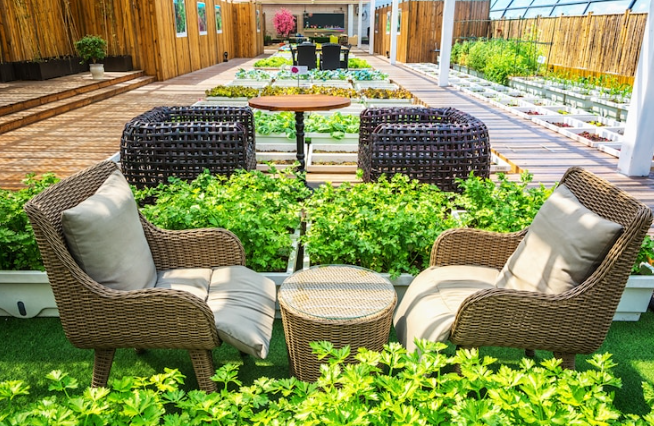
If you plan to have a space for entertaining friends and family, the first thing to add to your furniture shopping list is a seating and dining set. Depending on how many people you usually welcome into your place, you need to ensure everyone will have comfortable seating and space to enjoy your spread.
A big 6-seater dining table is a good size, as it provides enough seating for a small party but won’t overwhelm your patio. If you plan to have more guests, you can opt for a more oversized table or one that expands to accommodate more seating. A table with bench seating is an excellent option to explore. You can also get a sectional sofa where guests can lounge and enjoy refreshments, provided you have outdoor space.
These are just the basics to have for entertaining. If hosting summer barbecues or cocktail hours at home is more your vibe, an outdoor grill and bar would be the perfect add-on to consider. Once you have all the furniture you need to entertain, it’s about creating a good layout so your guests can quickly and comfortably move around. Also, don’t forget to add lighting for ambiance!
A space you can have all to yourself for relaxation and escape would present a different set of needs. If you plan to have a place where you can enjoy breakfast or coffee in the mornings, try to get a quaint outdoor table. The size will rely on the number of members you have in your household, and a round table is a good option in this scenario. Additionally, this can double as a romantic setup for a candlelit dinner under the stars.
For bookworms, having a comfortable lounge chair creates a conducive environment for reading or even sunbathing during the Spring. If you need to seat more of your family, you can opt to have an outdoor sofa instead. If you’re looking for something a bit more unique, a swing chair or hammock is an excellent choice, especially if you enjoy a good rest or nap outdoors. A small fire pit or fireplace is a great addition to keep you warm during the evenings in cooler months or when you feel like firing up s’mores for the family.
Now, if you want your space to serve both purposes, then your selection of furniture also needs to be multi-purpose. For instance, you can opt to buy a coffee table ottoman that functions as a place to serve food, rest your drinks, and provides extra seating as well.
An outdoor daybed can be a sun lounger during the week and a sofa for guests on the weekend. You can also find coffee tables or benches that hide coolers inside—perfect for storing cold drinks during summer parties. But your furniture doesn’t have to be specifically multi-purpose for them to be. A sectional sofa provides a lot of seating for a party but can also delight one person. A dining table for four can be a dining table for six just by adding a few more chairs. Pinning down your plans ahead of time will be helpful during furniture selection, so whether you want your space for entertaining, relaxing, or both, choosing the perfect outdoor furniture will rely on your plans.
Smaller patio options might be limited, but it’s not impossible to create your dream outdoor space. Rather than forcing a dining table to fit in the area, you can opt for a bar with cocktail chairs. This option offers a space to serve food and drinks and a place to dine that doesn’t take up too much room.
If you want multiple seats for entertaining, you can find many bench styles that you can push towards the boundaries of your patio. Back rests of sofas take up unnecessary space so you can do without them. Add a few more throw pillows so your guests can still be comfortable. You also don’t need to limit yourself to elevated seats. Floor cushions provide snug seating and a relaxed ambiance, especially if you’re going for an eclectic look for your patio. Small areas require a bit more creativity, but anything is possible.
Get Low-Maintenance Furniture
No matter what style you go for, the best furniture you can choose for your patio are ones that are a breeze to clean and don’t need constant repair. After hosting a big party until the wee hours of the morning, the last thing you want to do is viciously scrub away wine stains from your outdoor sofa cushion or aching after the loss of one of your chair’s armrests. Even if you have the option to hire professionals to take care of cleanup, you will rack up quite a bill, especially if you have to call them regularly. So the best thing you can do for your outdoor space (and your wallet) is to pick furniture that is manageable enough to spruce up yourself or that doesn’t need maintenance.
Similar to the first tip, you can start doing this by first factoring in the use of your space. Will it be used primarily for dining, entertaining, or relaxing? Doing this allows you to anticipate all the wear and tear your furniture will eventually have to endure. Trust us—rain isn’t the only thing that should concern you. After pinning down your patio’s primary purpose, it’s about choosing furniture with suitable materials and design that can weather through even the toughest of perpetrators, whether drink or food spillages, rough-housing kids, or the occasional downpour.
If you’re planning to host parties, barbecues, or dinners in your home, then your furniture should be able to cope with the continuous use. Furniture made with wrought-iron or solid wood is a great option that can withstand constant handling. These pieces will have a higher price tag, but getting regular repairs or swapping out your furniture after 2-3 years will cost you much more in the long run. So it’s always a good idea to invest in quality pieces.
Other than materials, design can contribute to the longevity of your furniture. For example, there’s no controlling how many people will sit on your outdoor sofa at any given time, so it’s best to get one that can tolerate the weight of its maximum capacity. In this case, you’d want to get a sofa set that has a sturdy enough base. A great option is to go for a low-seated sofa rather than one with legs, so you don’t risk any legs buckling under too much weight. For dining chairs, you can opt for ones with reinforced legs.
As for upholstery fabric, go for fabrics with fibers that are virtually stain-proof. Synthetic fibers such as nylon and acrylic are good options. Unlike natural fibers, they are much sturdier and are not prone to staining. If something spills on them, a good cycle in the washing machine should quickly fix the issue. Better yet, you can upholster your furniture with hydrophobic fabrics to repel liquids. You also have the option to do without cushions. Many seating options provide great comfort despite the lack of cushioning. If you’re concerned about the maintenance of upholstery, then you can do away with them altogether.
Even if you don’t entertain, everyday use by you and your household can also wear out your furniture, especially if you have kids or pets. Children and pets are creatures of destruction and are clever at finding ways to make a mess of everything in sight. But we have to make a lovely home somehow. So if you have little feet running around your house, you might want to protect your furniture from their grubby hands and paws.
Children see furniture as their playground. They will climb on them, jump on them, and they will throw things around. For their safety and the protection of your furniture, your pieces shouldn’t easily topple over when one tries to climb up on them. Avoid anything that easily wobbles under a bit of weight or push. If pets are also running around, you want to be sure everything stays in its place, especially when one collides with your furniture. If you have smaller children or untrained pets, you want to stay clear of anything with glass. Broken glass is not a biggie but someone may get hurt so play it safe.
Regarding materials, other than choosing stain-proof and waterproof fabrics, it’s best if you select furniture with tightly-knit upholstery. Plain weave fabrics can easily snag, especially if it gets caught in the claws of one of your furry friends. In time, you’ll find rips and tears in your lovely throws and cushions. Tightly-woven fabrics like denim are a better choice to save you the trouble of reupholstering often.
Make Adjustments for Weather
While on the subject of materials, the most significant factor you must consider when choosing the right material for your outdoor furniture is the climate in your area. Whether you live somewhere humid or dry, hot or cold, all of these play into selecting the right furniture for your home so you’ll know whether it can withstand any weather that comes it’s way.
Believe it or not, the sun can do as much damage to furniture as rain can, so even if you live in a dry city, you must make the same considerations. Selecting appropriate furniture for your climate will help your patio look pristine for much longer and ultimately save you money.
With so many things to take into account, it will be tempting to pick out furniture made of plastic, especially when there is aesthetically pleasing plastic outdoor furniture out there. It’s easy to maintain, won’t break the bank, and can withstand all kinds of weather. But plastic tends to degrade quickly over time, and they aren’t precisely tres chic.
There are many tried and tested furniture materials, but you can easily narrow it down by selecting one that goes well with your climate and your home’s overall look. If you live in a humid environment, one of the best choices is pieces made with powder-coated metals. Not only will powder-coated metal furniture tolerate a lot of wear, but their tough exteriors can also combat rust even when exposed to rain. Materials used in furniture include steel and wrought iron, but aluminum and cast aluminum are the most popular.
Aluminum and cast aluminum are sought-after materials for outdoor furniture because of their ability to tolerate all kinds of weather. Aluminum and cast aluminum furniture can sit in the hot summer sun in the morning and weather through cold rain in the afternoon. What’s more, cast aluminum furniture is sturdy and has weighty pieces that are unshakable against strong winds. Metal furniture designs are also diverse, so you find ones in the style of your home, whether it’s modern or colonial.
Wicker furniture is another versatile material that can endure unpredictable weather patterns. If you live in a place where the climate is rainy in the early mornings yet hot and sunny in the afternoons, then wicker might be your best bet. Wicker might sound a little too old-fashioned for some, but you can now find wicker furniture in more contemporary designs, colors, and shapes. Wicker is a material most commonly found in tropical-inspired homes and resorts. If you’re going for a tropical oasis for your backyard, you may want to explore that option.
Teak wood is another material used in many resort furniture because it is naturally moisture-resistant and can be exposed to extreme direct sunlight, making them perfect for poolside or beachfront furniture. It can go from wet to dry without it wearing out. Though with a lot of wood furniture, teak needs some maintenance. After a lot of exposure to moisture and heat, the wood tends to pale in color. Thankfully, the remedy is to occasionally slather the wood with teak oil, and it will return to its former glory. Like teak, hardwoods like cedar and redwood also weather well and are resistant to rot and insects, making them the perfect materials for outdoor dining tables and chairs.
Now, for homes with a brutalist or industrial feel to them, concrete is also a good choice. Naturally, concrete is sturdy and can weather through any climate. Although, furniture made entirely with concrete may be too heavy. A mixture of metal and concrete is a better selection. You can apply concrete to your tabletops or countertops to give them a raw, modern look.
If snow is an annual visitor in your area during wintertime, don’t attempt to test whether your furniture can withstand the extreme cold and snow. Even if they can go through the entire winter without any damage, it is still best to avoid caution. Furniture covers are a simple solution to protect your furniture from snow. Or, if you have a big enough garage, you can store them there for the season.
Think Long Term
Once you’ve chosen the materials you want for your furniture, it’s time to narrow down the style requirements. Even if you have an ideal look for your patio now, your ideas and preferences may change over time. A great way to approach this is to find furniture that you can easily switch up and customize without buying anything new.
For seating, sectional or modular sofas are particularly great because you can swap the different sections to create a different layout or design. You can choose L-type seating that hugs around a big coffee table or two extended seats facing one another, and you can create two separate seating areas if you have ample space. Versatile furniture lets you freshen up the look of your patio as often as you’d like.
You can apply the same approach to your dining area. Rather than choosing a static, single dining table for entertaining, you can get two or three square dining sets instead. You can push them together when you want a big center dining area and still have the option to switch it up when you feel like having one dining table in your patio area and one in the garden or even just splitting it to create more seating. You don’t always have to use what’s available, and you can be creative with your options to make them more suitable for your taste and needs.
Another inexpensive way to freshen up the look of your patio is by changing your furniture upholstery. Go for furniture with cushions and throws that have removable covers, so they’re easy to clean but also change out. For instance, if you want your patio to have a light and airy feel, go for classic white cushions. If you want a splash of color during the summer, go for a bold orange or bright florals. For a sleek, modern feel, you can change it to black.
Depending on the available space, you can plan out the original layout you have in mind. If you’re going to add a feature that needs to be more permanent, like an outdoor oven or kitchen, then select the most optimal place to situate it. After which, you can now decide where it’s possible to place your seating and dining areas keeping in mind possible relocation in the future. Your space should allow room for constant re-layout and redesign.
If you’re paying a hefty dime on your furniture, ideally, you will want to get your money’s worth and enjoy them for several years to come. However, the challenge for many homeowners is that trends frequently change over time. Your furnishings and decor may be fashionable today but may become outdated after 2 or 3 years, so you’ll start itching for a bit of redecoration sooner than later.
To prevent this, pier 1 suggests getting furniture pieces in classic or straightforward designs. Classics are classics because they never go out of style. You can update the look of your outdoor space by accessorizing it with trendy furnishings. But for larger, more expensive pieces, it’s best to go with something that can easily go from one trend to the next.
Prioritize Comfort
Having a perfect and Instagram-worthy space is all well and good, but if the room in your home isn’t providing you with the satisfaction and enjoyment you hoped it would, then all your planning would have been for nothing. A beautiful home is livable, so comfort should be at the top of your priority list. There is no sense in buying furniture you won’t ultimately enjoy.
Once you’ve pinned down the design, materials, and style that suits your home, take your chosen furniture for a test run. Just like mattresses, furniture should feel good to sit or lay on. This way, you can test specifics like whether you want softer sofa cushions or if the dining chairs feel too hard to sit on for an extended period. If they don’t feel great and you’re finding it difficult to imagine yourself easing into these pieces, they may not be the right ones for you and your space. You have many options to go through, so give the selection process the time to get it right. You don’t want to jump on anything you’ll regret buying later.
To add, if you’re worrying too much about keeping your furniture looking good and new, you have to take a step back and reassess the purpose of your space. Are you creating an outdoor space for you to experience or a showroom to admire? It’s easy to get caught up with aesthetics in the planning and designing process, especially when creating your dream space, but function will always be the end goal for any room in your home. So if you want a relaxing outdoor space, find furniture that will allow you to relax or if you always want to have friends over, choose pieces that create a homey and inviting space. In the end, the perfect outdoor furniture pieces are the ones that will give you and your household the most pleasure and gratification.